Advanced plotting
This tutorial will go over more advanced plotting functionality. Before
reading this, you should take a look at the basic analysis and plotting
tutorial. First, we’ll load in some example data. This dataset is an
egg comprised of 30 subjects, who each performed 8 study/test blocks
of 16 words each.
import quail
%matplotlib inline
egg = quail.load_example_data()
/usr/local/lib/python3.6/site-packages/pydub/utils.py:165: RuntimeWarning: Couldn't find ffmpeg or avconv - defaulting to ffmpeg, but may not work
  warn("Couldn't find ffmpeg or avconv - defaulting to ffmpeg, but may not work", RuntimeWarning)
Accuracy
accuracy = egg.analyze('accuracy')
accuracy.get_data().head()
| 0 | ||
|---|---|---|
| Subject | List | |
| 0 | 0 | 0.5000 |
| 1 | 0.5625 | |
| 2 | 0.1250 | |
| 3 | 0.5625 | |
| 4 | 0.3125 |
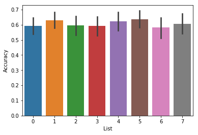
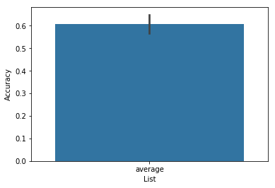
By default, the analyze function will perform an analysis on each
list separately, so when you plot the result, it will plot a separate
bar for each list, averaged over all subjects:
ax = accuracy.plot()
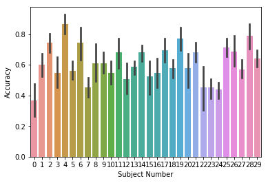
We can plot the accuracy for each subject by setting
plot_type='subject', and we can change the name of the subject
grouping variable by setting the subjname kwarg:
ax = accuracy.plot(plot_type='subject', subjname='Subject Number')
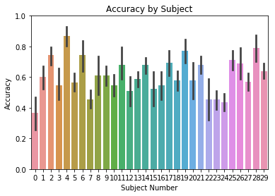
Furthermore, we can add a title using the title kwarg, and change
the y axis limits using ylim:
ax = accuracy.plot(plot_type='subject', subjname='Subject Number',
                title='Accuracy by Subject', ylim=[0,1])
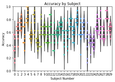
In addition to bar plots, accuracy can be plotted as a violin or swarm
plot by using the plot_style kwarg:
ax = accuracy.plot(plot_type='subject', subjname='Subject Number',
                title='Accuracy by Subject', ylim=[0,1], plot_style='violin')
ax = accuracy.plot(plot_type='subject', subjname='Subject Number',
                title='Accuracy by Subject', ylim=[0,1], plot_style='swarm')
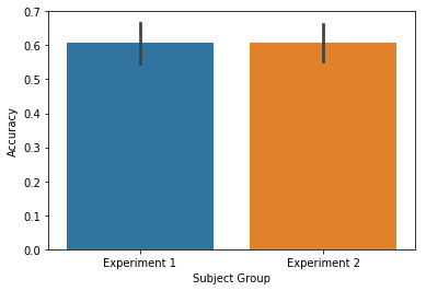
We can also group the subjects. This is useful in cases where you might
want to compare analysis results across multiple experiments. To do this
we will reanalyze the data, averaging over lists within a subject, and
then use the subjgroup kwarg to group the subjects into two sets:
accuracy = egg.analyze('accuracy', listgroup=['average']*8)
accuracy.get_data().head()
| 0 | ||
|---|---|---|
| Subject | List | |
| 0 | average | 0.367188 |
| 1 | average | 0.601562 |
| 2 | average | 0.742188 |
| 3 | average | 0.546875 |
| 4 | average | 0.867188 |
ax = accuracy.plot(subjgroup=['Experiment 1']*15+['Experiment 2']*15)
Oops, what happened there? By default, the plot function looks to
the List column of the df to group the data. To group according to
subject group, we must tell the plot function to plot by subjgroup.
This can be achieved by setting plot_type='subject':
ax = accuracy.plot(subjgroup=['Experiment 1']*15+['Experiment 2']*15, plot_type='subject')
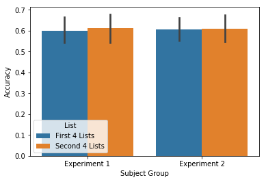
If you also have a list grouping (such as first 4 lists / second 4
lists), you can plot the interaction by setting plot_type='split'.
This will create a plot with respect to both the subjgroup and
listgroup:
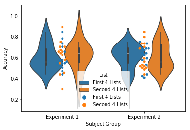
accuracy = egg.analyze('accuracy', listgroup=['First 4 Lists']*4+['Second 4 Lists']*4)
ax = accuracy.plot(subjgroup=['Experiment 1']*15+['Experiment 2']*15, plot_type='split')
Like above, these plots can also be violin or swarm plots:
ax = accuracy.plot(subjgroup=['Experiment 1']*15+['Experiment 2']*15, plot_type='split', plot_style='violin')
ax = accuracy.plot(subjgroup=['Experiment 1']*15+['Experiment 2']*15, plot_type='split', plot_style='swarm')
Memory fingerprints
The Memory Fingerprint plotting works exactly the same as the the
accuracy plots, with the except that plot_type='split' only works
for the accuracy plots, and the default plot_style is a violinplot,
instead of a barplot.
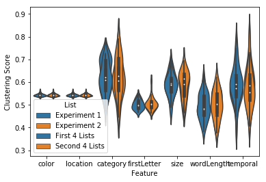
fingerprint = egg.analyze('fingerprint', listgroup=['First 4 Lists']*4+['Second 4 Lists']*4)
ax = fingerprint.plot(subjgroup=['Experiment 1']*15+['Experiment 2']*15, plot_type='subject')
ax = fingerprint.plot(subjgroup=['Experiment 1']*15+['Experiment 2']*15, plot_type='list')
Other analyses
Like the plots above, spc, pfr and lagcrp plots can all be plotted
according to listgroup or subjgroup by setting the plot_type
kwarg.
Plot by list grouping
listgroup = ['First 4 Lists']*4+['Second 4 Lists']*4
plot_type = 'list'
spc = egg.analyze('spc', listgroup=listgroup)
ax = spc.plot(plot_type=plot_type, ylim=[0, 1])
pfr = egg.analyze('pfr', listgroup=listgroup)
ax = pfr.plot(plot_type=plot_type)
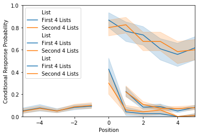
lagcrp = egg.analyze('lagcrp', listgroup=listgroup)
ax = lagcrp.plot(plot_type=plot_type)
/Users/andrewheusser/Documents/github/quail_contextlab/quail/analysis/lagcrp.py:129: RuntimeWarning: Mean of empty slice
  return np.nanmean(lagcrp, axis=0)
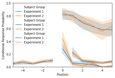
Plot by subject grouping
listgroup=['average']*8
subjgroup = ['Experiment 1']*15+['Experiment 2']*15
plot_type = 'subject'

spc = egg.analyze('spc', listgroup=listgroup)
ax = spc.plot(subjgroup=subjgroup, plot_type=plot_type, ylim=[0,1])

pfr = egg.analyze('pfr', listgroup=listgroup)
ax = pfr.plot(subjgroup=subjgroup, plot_type=plot_type)

lagcrp = egg.analyze('lagcrp', listgroup=listgroup)
ax = lagcrp.plot(subjgroup=subjgroup, plot_type=plot_type)
/Users/andrewheusser/Documents/github/quail_contextlab/quail/analysis/lagcrp.py:129: RuntimeWarning: Mean of empty slice
  return np.nanmean(lagcrp, axis=0)