Basic analyzing and plotting
This tutorial will go over the basics of analyzing eggs, the primary
data structure used in quail. To learn about how an egg is set up,
see the egg tutorial.
An egg is made up of (at minimum) the stimuli presented to a subject and the stimuli recalled by the subject. With these, two components we can perform a number of analyses:
- Recall Accuracy - the proportion of stimuli presented that were later recalled
- Serial Position Curve - recall accuracy as a function of the encoding position of the stimulus
- Probability of First Recall - the probability that a stimulus will be recalled first as a function of its encoding position
- Lag-CRP - given the recall of word n, the probability of recalling stimuli at neighboring positions (n+/-1, 2, 3 etc).
- Temporal Clustering - a measure of recall clustering by temporal proximity during encoding
If we have a set of features for the stimuli, we can also compute a Memory Fingerprint, which is an estimate of how a subject clusters their recall responses with respect to features of a stimulus (see the fingerprint tutorial for more on this).
Let’s get to analyzing some eggs. First, we’ll load in some example
data:
import quail
%matplotlib inline

egg = quail.load_example_data()
/usr/local/lib/python3.6/site-packages/pydub/utils.py:165: RuntimeWarning: Couldn't find ffmpeg or avconv - defaulting to ffmpeg, but may not work
  warn("Couldn't find ffmpeg or avconv - defaulting to ffmpeg, but may not work", RuntimeWarning)
This dataset is comprised of 30 subjects, who each performed 8 study/test blocks of 16 words each. Here are some of the presented words:
egg.get_pres_items().head()
| 0 | 1 | 2 | 3 | 4 | 5 | 6 | 7 | 8 | 9 | 10 | 11 | 12 | 13 | 14 | 15 | ||
|---|---|---|---|---|---|---|---|---|---|---|---|---|---|---|---|---|---|
| Subject | List | ||||||||||||||||
| 0 | 0 | b'BROCCOLI' | b'CAULIFLOWER' | b'ONION' | b'PICKLE' | b'STRAINER' | b'SAUCER' | b'DISH' | b'BUTTERCUP' | b'GRIDDLE' | b'CARPET' | b'FLOOR' | b'FOUNDATION' | b'ELEVATOR' | b'AZALEA' | b'DAHLIA' | b'LOG' |
| 1 | b'POTATO' | b'CHIMNEY' | b'GERMANY' | b'BLOUSE' | b'EGYPT' | b'LOBBY' | b'JACKET' | b'ARTICHOKE' | b'CLOSET' | b'SUIT' | b'CUBA' | b'GARLIC' | b'CAMISOLE' | b'SPINACH' | b'IRAN' | b'FURNACE' | |
| 2 | b'OVEN' | b'TUBA' | b'MONTREAL' | b'MUG' | b'HIP' | b'BROILER' | b'PICCOLO' | b'ARMS' | b'DALLAS' | b'ROME' | b'TRUMPET' | b'PELVIS' | b'THERMOMETER' | b'TAMBOURINE' | b'PARIS' | b'STOMACH' | |
| 3 | b'MOOSE' | b'MICHIGAN' | b'CLEMENTINE' | b'ANTELOPE' | b'MONKEY' | b'RIB' | b'RACOON' | b'FLORIDA' | b'TONGUE' | b'POMEGRANATE' | b'PEAR' | b'IOWA' | b'PANCREAS' | b'KANSAS' | b'LEMON' | b'TOOTH' | |
| 4 | b'KITCHEN' | b'ROSE' | b'DOG' | b'CARNATION' | b'BARN' | b'DONKEY' | b'TIGER' | b'EAR' | b'FACE' | b'GAZEBO' | b'HEART' | b'PETUNIA' | b'HIPPOPOTAMUS' | b'ALCOVE' | b'TULIP' | b'KNUCKLE' |
and some of the recalled words:
egg.get_rec_items().head()
| 0 | 1 | 2 | 3 | 4 | 5 | 6 | 7 | 8 | 9 | ... | 12 | 13 | 14 | 15 | 16 | 17 | 18 | 19 | 20 | 21 | ||
|---|---|---|---|---|---|---|---|---|---|---|---|---|---|---|---|---|---|---|---|---|---|---|
| Subject | List | |||||||||||||||||||||
| 0 | 0 | b'BROCCOLI' | b'CAULIFLOWER' | b'ONION' | b'DISH' | b'GRIDDLE' | b'DAHLIA' | b'SAUCER' | b'AZALEA' | None | None | ... | None | None | NaN | NaN | NaN | NaN | NaN | NaN | NaN | NaN |
| 1 | b'FURNACE' | b'CHIMNEY' | b'CUBA' | b'GERMANY' | b'ARTICHOKE' | b'SPINACH' | b'POTATO' | b'SUIT' | b'CLOSET' | b'CHIMNEY' | ... | None | None | NaN | NaN | NaN | NaN | NaN | NaN | NaN | NaN | |
| 2 | b'MAINE' | b'ARMS' | b'PARIS' | None | None | None | None | None | None | None | ... | None | None | NaN | NaN | NaN | NaN | NaN | NaN | NaN | NaN | |
| 3 | b'IS' | b'RIB' | b'PANCREAS' | b'CLEMENTINE' | b'LEMON' | b'IOWA' | b'FLORIDA' | b'MICHIGAN' | b'MOOSE' | b'MONKEY' | ... | None | None | NaN | NaN | NaN | NaN | NaN | NaN | NaN | NaN | |
| 4 | b'CARNATION' | b'ROSE' | b'TULIP' | b'HIPPOPOTAMUS' | b'ALCOVE' | None | None | None | None | None | ... | None | None | NaN | NaN | NaN | NaN | NaN | NaN | NaN | NaN |
5 rows × 22 columns
We can start with the simplest analysis - recall accuracy - which is
just the proportion of stimuli recalled that were in the encoding lists.
To compute accuracy, simply call the analyze method, with the
analysis key word argument set to accuracy:
Recall Accuracy
acc = egg.analyze('accuracy')
acc.get_data().head()
| 0 | ||
|---|---|---|
| Subject | List | |
| 0 | 0 | 0.5000 |
| 1 | 0.5625 | |
| 2 | 0.1250 | |
| 3 | 0.5625 | |
| 4 | 0.3125 |
The result is a FriedEgg data object. The accuracy data can be
retrieved using the get_data method, which returns a multi-index
Pandas DataFrame where the first-level index is the subject identifier
and the second level index is the list number. By default, note that
each list is analyzed separately. However, you can easily return the
average over lists using the listgroup kew word argument:
accuracy_avg = egg.analyze('accuracy', listgroup=['average']*8)
accuracy_avg.get_data().head()
| 0 | ||
|---|---|---|
| Subject | List | |
| 0 | average | 0.367188 |
| 1 | average | 0.601562 |
| 2 | average | 0.742188 |
| 3 | average | 0.546875 |
| 4 | average | 0.867188 |
Now, the result is a single value for each subject representing the
average accuracy across the 16 lists. The listgroup kwarg can also
be used to do some fancier groupings, like splitting the data into the
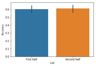
first and second half of the experiment:
accuracy_split = egg.analyze('accuracy', listgroup=['First Half']*4+['Second Half']*4)
accuracy_split.get_data().head()
| 0 | ||
|---|---|---|
| Subject | List | |
| 0 | First Half | 0.437500 |
| Second Half | 0.296875 | |
| 1 | First Half | 0.546875 |
| Second Half | 0.656250 | |
| 2 | First Half | 0.734375 |
These analysis results can be passed directly into the plot function like so:
accuracy_split.plot()
<matplotlib.axes._subplots.AxesSubplot at 0x115714710>
For more details on plotting, see the advanced plotting tutorial. Next,
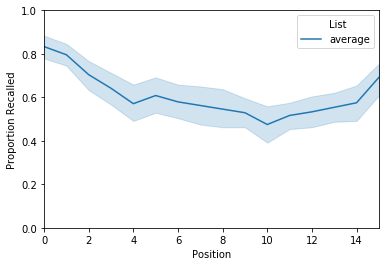
lets take a look at the serial position curve analysis. As stated above
the serial position curve (or spc) computes recall accuracy as a
function of the encoding position of the stimulus. To use it, use the
same analyze method illustrated above, but set the analysis
kwarg to spc. Let’s also average across lists within subject:
Serial Position Curve
spc = egg.analyze('spc', listgroup=['average']*8)
spc.get_data().head()
| 0 | 1 | 2 | 3 | 4 | 5 | 6 | 7 | 8 | 9 | 10 | 11 | 12 | 13 | 14 | 15 | ||
|---|---|---|---|---|---|---|---|---|---|---|---|---|---|---|---|---|---|
| Subject | List | ||||||||||||||||
| 0 | average | 0.625 | 0.625 | 0.375 | 0.250 | 0.250 | 0.375 | 0.125 | 0.375 | 0.250 | 0.375 | 0.250 | 0.250 | 0.375 | 0.625 | 0.500 | 0.250 |
| 1 | average | 0.875 | 0.625 | 0.375 | 0.625 | 0.625 | 0.625 | 0.750 | 0.625 | 0.375 | 0.500 | 0.375 | 0.875 | 0.750 | 0.375 | 0.625 | 0.625 |
| 2 | average | 0.875 | 1.000 | 0.750 | 0.875 | 0.500 | 0.750 | 0.625 | 1.000 | 0.750 | 0.625 | 0.625 | 0.625 | 0.875 | 0.625 | 0.750 | 0.625 |
| 3 | average | 0.875 | 1.000 | 0.750 | 0.750 | 0.625 | 0.625 | 0.500 | 0.500 | 0.250 | 0.500 | 0.000 | 0.375 | 0.625 | 0.375 | 0.375 | 0.625 |
| 4 | average | 1.000 | 1.000 | 1.000 | 1.000 | 0.750 | 0.875 | 0.875 | 0.875 | 1.000 | 0.750 | 0.750 | 0.625 | 0.750 | 0.750 | 1.000 | 0.875 |
The result is a df where each row is a subject and each column is the encoding position of the word. To plot, simply pass the result of the analysis function to the plot function:
spc.plot(ylim=[0, 1])
<matplotlib.axes._subplots.AxesSubplot at 0x115758240>
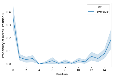
Probability of First Recall
The next analysis we’ll take a look at is the probability of first
recall, which is the probability that a word will be recalled first as a
function of its encoding position. To compute this, call the analyze
method with the analysis kwarg set to pfr. Again, we’ll average
over lists:
pfr = egg.analyze('pfr', listgroup=['average']*8)
pfr.get_data().head()
| 0 | 1 | 2 | 3 | 4 | 5 | 6 | 7 | 8 | 9 | 10 | 11 | 12 | 13 | 14 | 15 | ||
|---|---|---|---|---|---|---|---|---|---|---|---|---|---|---|---|---|---|
| Subject | List | ||||||||||||||||
| 0 | average | 0.250 | 0.000 | 0.000 | 0.125 | 0.0 | 0.0 | 0.000 | 0.0 | 0.0 | 0.125 | 0.125 | 0.0 | 0.000 | 0.000 | 0.000 | 0.125 |
| 1 | average | 0.250 | 0.000 | 0.000 | 0.000 | 0.0 | 0.0 | 0.000 | 0.0 | 0.0 | 0.000 | 0.000 | 0.0 | 0.250 | 0.000 | 0.375 | 0.000 |
| 2 | average | 0.375 | 0.000 | 0.000 | 0.000 | 0.0 | 0.0 | 0.125 | 0.0 | 0.0 | 0.000 | 0.125 | 0.0 | 0.125 | 0.125 | 0.000 | 0.125 |
| 3 | average | 0.625 | 0.125 | 0.000 | 0.000 | 0.0 | 0.0 | 0.000 | 0.0 | 0.0 | 0.000 | 0.000 | 0.0 | 0.000 | 0.000 | 0.125 | 0.125 |
| 4 | average | 0.250 | 0.000 | 0.125 | 0.000 | 0.0 | 0.0 | 0.000 | 0.0 | 0.0 | 0.000 | 0.000 | 0.0 | 0.375 | 0.125 | 0.000 | 0.125 |
This df is set up just like the serial position curve. To plot:
pfr.plot()
<matplotlib.axes._subplots.AxesSubplot at 0x1158b5160>
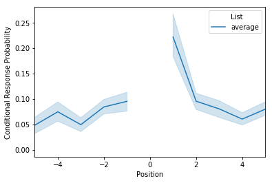
Lag-CRP
The next analysis to consider is the lag-CRP, which again is a function
that given the recall of word n, returns the probability of recalling
words at neighboring positions (n+/-1, 2, 3 etc). To use it? You guessed
it: call the analyze method with the analysis kwarg set to
lagcrp:
lagcrp = egg.analyze('lagcrp', listgroup=['average']*8)
lagcrp.get_data().head()
/Users/andrewheusser/Documents/github/quail_contextlab/quail/analysis/lagcrp.py:129: RuntimeWarning: Mean of empty slice
  return np.nanmean(lagcrp, axis=0)
| -16 | -15 | -14 | -13 | -12 | -11 | -10 | -9 | -8 | -7 | ... | 7 | 8 | 9 | 10 | 11 | 12 | 13 | 14 | 15 | 16 | ||
|---|---|---|---|---|---|---|---|---|---|---|---|---|---|---|---|---|---|---|---|---|---|---|
| Subject | List | |||||||||||||||||||||
| 0 | average | 0.0 | 0.125 | 0.1250 | 0.0625 | 0.000000 | 0.000000 | 0.041667 | 0.062500 | 0.083333 | 0.000000 | ... | 0.229167 | 0.025000 | 0.083333 | 0.000000 | 0.0 | 0.062500 | 0.250000 | 0.0 | 0.0 | 0.0 |
| 1 | average | 0.0 | 0.000 | 0.0000 | 0.0000 | 0.041667 | 0.000000 | 0.000000 | 0.041667 | 0.087500 | 0.041667 | ... | 0.041667 | 0.056250 | 0.000000 | 0.062500 | 0.0 | 0.104167 | 0.062500 | 0.0 | 0.0 | 0.0 |
| 2 | average | 0.0 | 0.125 | 0.0625 | 0.0000 | 0.041667 | 0.041667 | 0.000000 | 0.000000 | 0.187500 | 0.000000 | ... | 0.015625 | 0.077083 | 0.000000 | 0.031250 | 0.0 | 0.000000 | 0.000000 | 0.0 | 0.0 | 0.0 |
| 3 | average | 0.0 | 0.250 | 0.0000 | 0.0000 | 0.000000 | 0.166667 | 0.062500 | 0.062500 | 0.250000 | 0.093750 | ... | 0.062500 | 0.072917 | 0.092857 | 0.020833 | 0.0 | 0.031250 | 0.000000 | 0.0 | 0.0 | 0.0 |
| 4 | average | 0.0 | 0.125 | 0.1250 | 0.0000 | 0.000000 | 0.000000 | 0.125000 | 0.000000 | 0.000000 | 0.013889 | ... | 0.013889 | 0.000000 | 0.000000 | 0.000000 | 0.0 | 0.000000 | 0.041667 | 0.0 | 0.0 | 0.0 |
5 rows × 33 columns
Unlike the previous two analyses, the result of this analysis returns a df where the number of columns are double the length of the lists. To view the results:
lagcrp.plot()
<matplotlib.axes._subplots.AxesSubplot at 0x115924630>
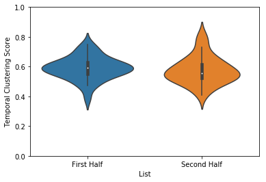
Temporal clustering
Another way to evaluate temporal clustering is to measure the temporal distance of each transition made with respect to where on a list the subject could have transitioned. This ‘temporal clustering score’ is a good summary of how strongly participants are clustering their responses according to temporal proximity during encoding.
temporal = egg.analyze('temporal', listgroup=['First Half']*4+['Second Half']*4)
temporal.plot(plot_style='violin', ylim=[0,1])
<matplotlib.axes._subplots.AxesSubplot at 0x115a86da0>
Memory Fingerprint
Last but not least is the memory fingerprint analysis. For a detailed treatment of this analysis, see the fingerprint tutorial.
As described in the fingerprint tutorial, the features data
structure is used to estimate how subjects cluster their recall
responses with respect to the features of the encoded stimuli. Briefly,
these estimates are derived by computing the similarity of neighboring
recall words along each feature dimension. For example, if you recall
“dog”, and then the next word you recall is “cat”, your clustering by
category score would increase because the two recalled words are in the
same category. Similarly, if after you recall “cat” you recall the word
“can”, your clustering by starting letter score would increase, since
both words share the first letter “c”. This logic can be extended to any
number of feature dimensions.
Here is a glimpse of the features df:
egg.feature_names
['color',
 'location',
 'category',
 'firstLetter',
 'size',
 'wordLength',
 'temporal']
Like the other analyses, computing the memory fingerprint can be done
using the analyze method with the analysis kwarg set to
fingerprint:
fingerprint = egg.analyze('fingerprint', listgroup=['average']*8)
fingerprint.get_data().head()
| color | location | category | firstLetter | size | wordLength | temporal | ||
|---|---|---|---|---|---|---|---|---|
| Subject | List | |||||||
| 0 | average | 0.535778 | 0.535778 | 0.587560 | 0.536292 | 0.648455 | 0.482460 | 0.418536 |
| 1 | average | 0.541546 | 0.541546 | 0.554500 | 0.492277 | 0.507837 | 0.522564 | 0.633390 |
| 2 | average | 0.548408 | 0.548408 | 0.618258 | 0.531006 | 0.601335 | 0.468233 | 0.659474 |
| 3 | average | 0.541722 | 0.541722 | 0.558331 | 0.501190 | 0.555992 | 0.446369 | 0.566537 |
| 4 | average | 0.560181 | 0.560181 | 0.519353 | 0.508005 | 0.559776 | 0.498794 | 0.763377 |
The result of this analysis is a df, where each row is a subject’s fingerprint and each column is a feature dimensions. The values represent a subjects tendency to cluster their recall responses along a particular feature dimensions. They are probability values, and thus, greater values indicate more clustering along that feature dimension. To plot, simply pass the result to the plot function:
order=sorted(egg.feature_names)
fingerprint.plot(order=order, ylim=[0, 1])
<matplotlib.axes._subplots.AxesSubplot at 0x115aae438>
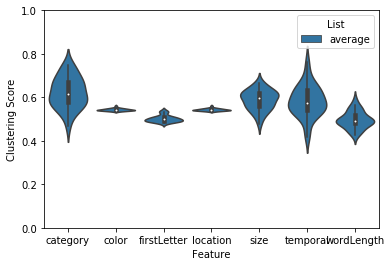
This result suggests that subjects in this example dataset tended to cluster their recall responses by category as well as the size (bigger or smaller than a shoebox) of the word. List length and other properties of your experiment can bias these clustering scores. To help with this, we implemented a permutation clustering procedure which shuffles the order of each recall list and recomputes the clustering score with respect to that distribution. Note: this also works with the temporal clustering analysis.
# warning: this can take a little while.  Setting parallel=True will help speed up the permutation computation
# fingerprint = quail.analyze(egg, analysis='fingerprint', listgroup=['average']*8, permute=True, n_perms=100)
# ax = quail.plot(fingerprint, ylim=[0,1.2])